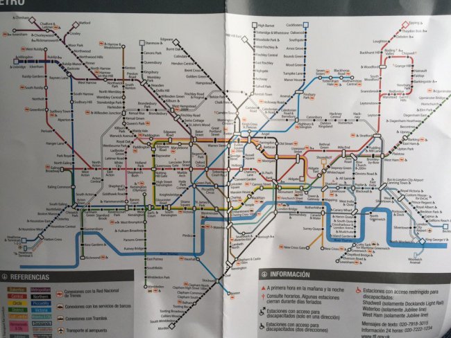
Remember how when the Tube map changed back in May, an extra kink was put into the Central line (on the online and posted editions only) to make it Crossrail-ready? Well, something else has happened with the new January 2016 map.
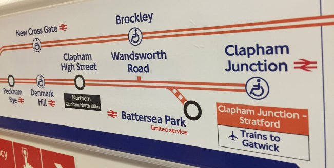
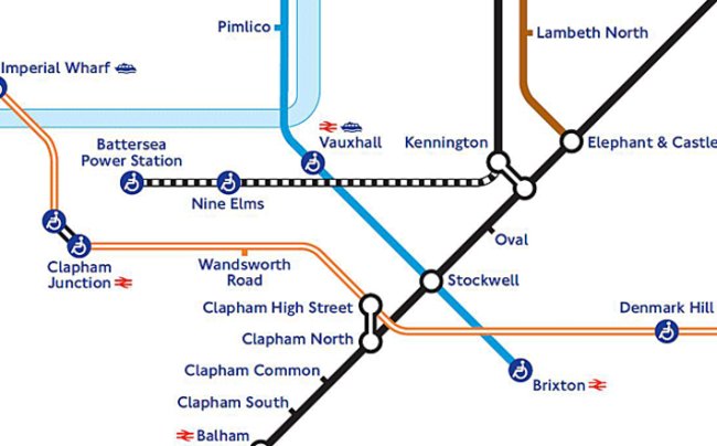
(Also, let’s note the fact that Vauxhall has got a blue ‘accessibility blob’ even though the lift is not yet operational, and so the map is wrong – Vauxhall is not an accessible station)
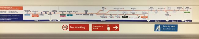
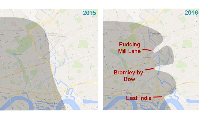
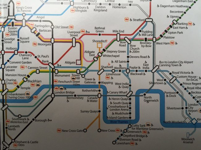
The Tube map last year on the southern bit of the Overground around the New Cross area looked like this:
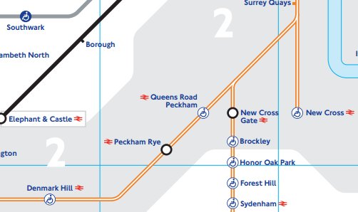
2015 Map
After Surrey Quays, the line went straight down to New Cross, with Clapham / West Croydon / Crystal Palace trains all following the same, then splitting with Queens Road Peckham on the Clapham branch and New Cross Gate heading straight down south.
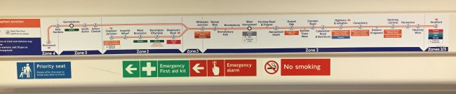
Well, now with the new January 2016 Tube map, it’s changed and has become a ‘3-way split’, here:
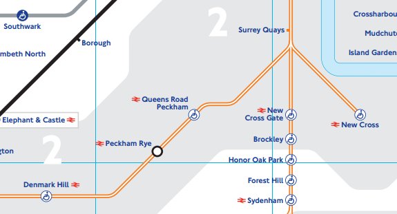
2016 Map
So why have they done this, you might ask?
It can only be because of a new Overground station that’s coming between Queens Road Peckham and Surrey Quays – namely Surrey Canal Road. Well – except it isn’t any more it’s may end up being called ‘New Bermondsey‘ instead, and work was expected to have started by now, but we don’t think it has!
But that’s some forward planning by the Tube map designers to get the name of the Overground in early, just as they’ve done with moving the Central line to accomodate Crossrail when it appears on map.
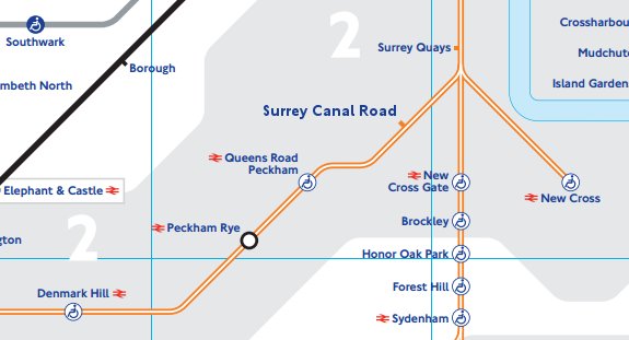
Or will it be called New Bermondsey?
