So after much speculation and build up, the new May 2015 Tube map is upon us with some rail services added as part of the Overground brand, plus ‘TfL Rail’ too.
Our immediate thought thought is that it’s not really a Tube map any more, is it?
That’s what people call it (and some people may still even refer to it as the Pocket Map or the Journey Planner). No – what it is now, more than ever, is clearly the ‘TfL Map‘ of services. Also, if you take into account that that only Underground services can be considered proper ‘Tube’, it’s worth noting that on the new map there are 270 Tube stations, but with the DLR and Overground combined (now 112 Overground stations, and 45 DLR stations) there are 157 stations on the new ‘Tube map’ that aren’t purely Underground stations.
Limited services at some stations
Aside from all the obvious and immediate observations (the new connector blobs, the sprawl of Orange, the fact that there’s now TWO Bethnal Green’s, and of course the new kink in the Central Line, in preparation for Crossrail) there are many more subtle things too.
One of the things about the Tube map (and Overground services) is that it’s always represented ‘turn up and go’ services – you don’t need timetables because trains are frequent enough, yet that isn’t the case any more.
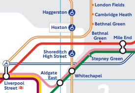
Not all Overground services out of Liverpool Street will stop at Bethnal Green, Cambridge Heath and London fields. If you want to go to one of those stations, you have to get the Cheshunt service – the Chingford and Enfield services don’t stop there, which is a bit of an instant fail of the map.
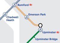
Emerson Park
Then there’s the Emerson Park branch – one stop in-between Romford and Upminster, now also coloured Overground orange. Except it has a limited service with no trains after 8pm on a weekday and none at all on a Sunday.
That sounds like a limited service to me – a bit like the District Line to Olympia which has a pecked line, but here it’s a standard cased Orange Overground line. Ok, so sure – the Waterloo & City Line doesn’t run on Sundays but that gets a mention in the side bar, so why doesn’t the Emerson Park branch not also get a mention? It also has the distinction of being the least served part of the map (previously was the Woodford to Hainault part of the Central Line where trains are once every 20 minutes), with just two trains per hour – one every 30 minutes.
There’s still then the headache of why Seven Sisters to South Tottenham does NOT have a connection blob, even though it’s just as close as the two Walthamstows and Wanstead Park to Forest Gate which are connected on the map. Intriguingly the London Rail map puts South Tottenham in the right geographical place – to the south of Seven Sisters, but the new TfL Map gets this wrong, putting it to the north.
And then there’s how lines overlap – a huge bugbear for some people. e.g. consistency is important in that all sub-surface Tube lines on the map do indeed go on top of Tube lines on the map but on the new TfL Map there’s no logic to it.
Over or under?
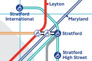
At Stratford International, the DLR goes underneath the Central Line but then it then goes over the TfL Rail line at Stratford – when in real life it goes below it.
Looking around the map, it seems that where possible, the map designers have taken the decision to deliberately put a ‘cased’ line below a solid coloured line – whether it does that in real life or not. It’s not as if a cased Overground line can’t go on top of another line – it has to in places where it crosses itself such as immediately south of Hackney Downs, so why not get it correct everywhere else?
And don’t forget TfL Rail – the line which is now the start of Crossrail as TfL take over services between Shenfield and Liverpool Street. It means there’s now another ‘Zone 9’ station to the map (joining Amersham and Chesham), as well as another ‘Special Fares Apply’, zone – joining Watford Junction – it’s also another twelve stations added to the map that aren’t Tube stations – so really, we can’t call it a Tube Map any more, it really is the TfL Map.
The Overground is arguably TfL’s proudest piece of branding, because despite frequent attempts of those long freight trains that break down on the North London Line, the Overground is consistently one of the best in terms of the percentage stats that trains turn up on time and are reliable. Plus the trains are new, shiny orange, and spacious – even more so now that fifth carriages are being added, it’s a great railway.
But even though the old/existing stock will run on the ‘new’ lines that are Overground until TfL replace them, our first thought is that all this will actually do is expand the brand too much and reliability figures will fall – the larger something is, the harder it becomes to manage.
If TfL get to take over any more lines in the future and have a desire to brand them as ‘Overground’ as well, there will need to be some distinction between the different Overground lines – having them named, or numbered – something – that helps differentiate between the sprawl of the Overground.
It’s also worth a chuckle over the TfL website that launched an interactive SVG version of the map on its website first – before the PDF was put online, and it’s got all sorts of problems including overlapping text, and a missing cablecar and Olympia branch. So instead have a look at this brilliant version which uses the TfL data, but actually draws it correctly!
Update
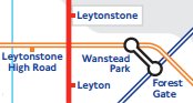
Leytonstone High Road
Leytonstone HIgh Road has moved! It used to be geographically correct to the right side of the Central Line, but in order to accomodate the connector blob between Wanstead Park and Forest Gate, it’s now been moved to the left (west) side of the Central line which is now geographically incorrect.
Someone’s also asked us if the ‘connection lines’ between the two blobs at Clapham Junction are correct. By TfL’s map design standards we say – yes, but all it does it highlight the inconsistencies on other parts of the map. e.g. Look at Westminster and Hammersmith – there’s a tiny connection line between the two blobs there, but at Earl’s Court there is not – why the inconsistency?