Main menu: Home Features 3D Maps User Guide Support Buy Now Disused Tube Blog

South Ken DMI

Whilst we were visiting South Ken to take a look at the new ‘pop up’ LTM Museum Shop, we also noticed that the Piccadilly line is getting new Dot Matrix Indicator boards (DMI) for next train information.

This is on the westbound platform, and is the small type – as we first saw appear on the Victoria line a couple of years ago.

It now shows the next three trains instead of two – although as it’s smaller it’s harder to read from a distance.   The clock seems to be 12 hours instead of 24 (we were there at 2 in the afternoon, not the morning), oh .. and it’s not correct anyway, as as we snapped this photo a PA went out telling people to look at the front of the train for the correct information, and sure enough – the next train that came in was one going to Rayners

South Kensington DMI

South Kensington DMI

Lane, and not Heathrow.  But apart from that …

11 Oct 15

A real good service

One of the things which we like to grumble about the most (and we hear others do too – including drivers) is the fabled ‘Good Service‘ announcement which plagues our eardrums on platforms and stations, and often gets automatically announced by a system which isn’t good enough to react quickly to situations on the tube where it’s gone wrong.

Nothing is more annoying when tube travelling than (say) the time when we waited 23 minutes for a Piccadilly Line train whilst being told several times that there was a ‘Good Service‘ when there clearly wasn’t.

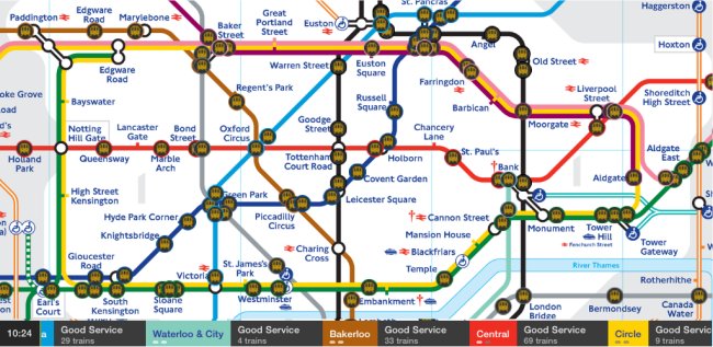
Which is why we love this – Andy Drizen’s Tube Map Live. Yes we’re plugging another App which we have no problem doing here if it’s one we really love, and we really love this one. Andy first produced the excellent Tube Tracker, and then subsequently came up with Tube Map Live, which plots the positions of the trains (from a feed from TfL) on a tube map.

The result? You can actually see for yourself the gap between the trains on any particular line, and thus judge for yourself if there really IS a ‘Good Service‘ or not.

Tube Map Live!

Tube Map Live!

Instead of the wasted money on the ‘rainbow board’ in every station bleating on about there being a good service, how great would it be if all stations actually had a display like this, showing you how the trains were actually running.  In the meantime, download the App (it’s free!), and watch them for yourselves.  Sometimes we watch them, just for fun – even if we’re not taking a journey anywhere!

28 Feb 14

Next train indicators on the Piccadilly

This appears to be new … for many months (going into years now), there have been ‘Next train’ Dot Matrix Indicators on the Piccadilly Line up to Rayners Lane, but since the day they were installed they have either never been activated, or just never worked.

(The situation at Ealing Common remains the same – on the eastbound platform, you can hear and then see the train pulling into the station before it even flashes up on the board, and on the westbound platform it often gets out of sync so a District train pulls in and says it’s going to Rayners Lane…)

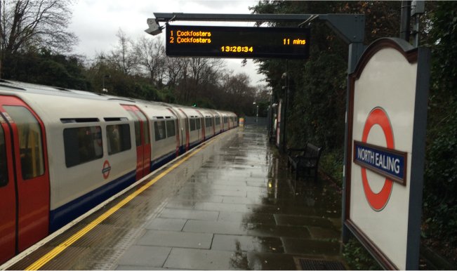
Until recently, we spotted that the ones at North Ealing are now working! And travelling up the line a little it appears the ones at Park Royal and Alperton are now also in use, but at Sudbury Town and and Hill they are not – still, having them now working at three stations is better than having them not work at all, and maybe it’s a sign that the others will be activated shortly …

North Ealing Dot Matrix Indicator

North Ealing Dot Matrix Indicator

27 Dec 13

Whoosh, go the the delays!

http://www.bbc.co.uk/news/uk-england-london-24580778Another new poster that has been popping up on the tube this week has been the Whoosh! one, proudly telling us that there are now 40% less delays on the tube.

This is great! Isn’t it?

Well it is… until you then perhaps look at it like this : How bad was the service before for it to be possible to have such a dramatic percentage cut in delays of 40%! That’s quite a lot, isn’t it? To us, it highlights how bad the service must have been in places to suddenly allow for such an improvement.

Note that it doesn’t say on which line(s) in particular the improvement was – something that would be interesting to know, whether it was just one line that improved, or was a general improvement across the whole network.


28 Nov 13